YoMetro Gets a New Look for Better User Experience
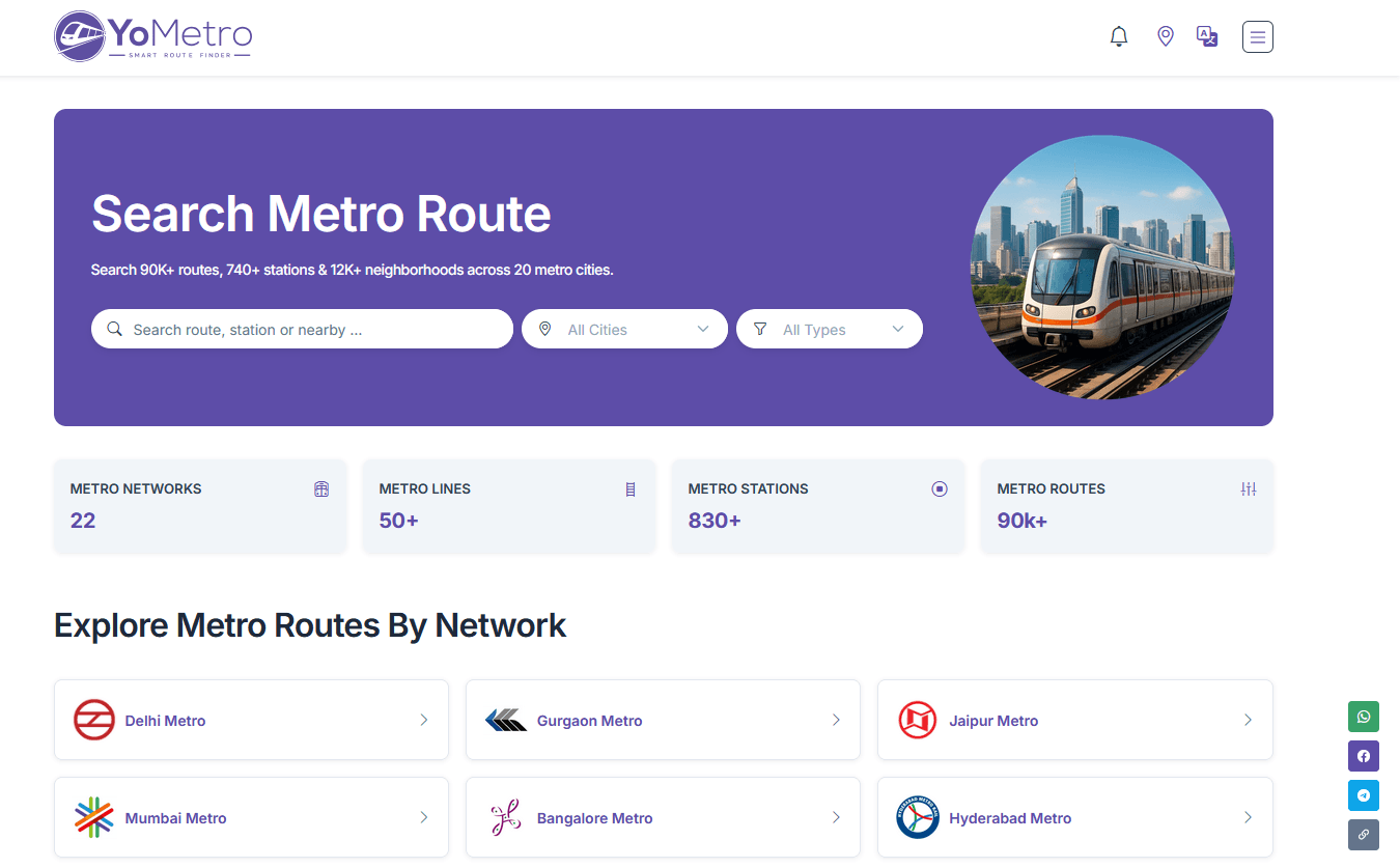
YoMetro's redesigned website offers cleaner navigation and a modern look.
YoMetro has rolled out a complete website redesign, giving its platform a fresh new look that makes metro travel planning more intuitive, faster, and visually appealing. The updated interface has been built with the everyday commuter in mind — focusing on clarity, ease of use, and a modern, clean aesthetic across all pages.
A New Look Designed for Better Usability
The redesigned YoMetro website brings meaningful improvements across all key sections of the platform. From the homepage layout to individual metro route and station pages, every screen has been carefully optimized for a smoother, more enjoyable user experience.
The new UI adopts a clean, card-based design system that makes it easier to scan and absorb information at a glance. Whether you are browsing metro networks, checking station details, or reading travel tips, the updated layout ensures that all important information is always visible and accessible.
What Has Changed in the New UI?
Simplified Navigation
The updated YoMetro navigation has been streamlined to reduce the number of steps required to reach the information you need. Key platform features — metro route search, city selection, station browsing, the news section, and travel tips — are now more prominently organized and easier to access from any page.
Refreshed Homepage Design
The homepage now features a bold, prominently placed search bar that immediately invites users to start their metro journey search. Metro networks are displayed in a well-organized grid layout with clear labels, making it simple to explore and switch between all 20 Indian metro cities covered by YoMetro.
Improved Station and Route Pages
Station and route detail pages have been redesigned with a better information hierarchy. Fare details, travel time, interchange information, and nearby places are now presented in clearly structured sections — making it faster for commuters to find what matters most during their journey planning.
Mobile-First Responsive Experience
The new UI has been built with a mobile-first approach, ensuring that YoMetro works seamlessly across smartphones, tablets, and desktop browsers. Commuters on the go can now access all platform features comfortably from any device without experiencing any layout or usability issues.
Key UI Improvements at a Glance
- Clean, card-based design for easier and faster information scanning
- Streamlined navigation with quicker access to all core features
- Bold homepage search bar for immediate metro route discovery
- Redesigned station and route pages with improved content hierarch
- Mobile-first responsive design that adapts to all screen sizes
- Improved typography and color system for better readability
- Optimized page structure for faster loading across all devices
How the New UI Improves Your Experience
The YoMetro redesign is not just about aesthetics — it is about making metro travel planning genuinely easier and more efficient. With clearer layouts and faster access to route and station data, commuters spend less time searching and more time traveling with confidence.
The updated news and blog section also benefits from the redesign, with article cards that display the title, category, and publication date at a glance — keeping commuters informed about the latest metro updates without having to dig through multiple pages.
Designed to Scale with India's Growing Metro Network
India's metro network is expanding rapidly, with new lines, stations, and cities being added regularly. As YoMetro grows to cover more routes and metro systems, a clean, scalable UI becomes essential to ensure users can always find what they need quickly and reliably.
The redesigned interface has been built to scale gracefully — meaning as more cities, routes, and features are added over time, the experience remains consistent, intuitive, and user-friendly for every type of metro commuter across India.